

Our Logos
Our logos are the most recognizable symbol of the brand, serving as a visual anchor that creates familiarity, builds trust, and ensures consistent recognition across every touchpoint. We have a family of different lock-ups that are best suited for different applications. This outlines how best to use them.
Logo Family
Our logo family is made up of 6 different lock-ups. These consist of combination marks, wordmarks and an icon.



Main Logo
Our primary logo.
Side by Side
This is our primary logo and is a combination mark. It should be used whenever possible and when it's important for the brand name to be present. It works best in horizontal formats. If there is limited horizontal space a stacked version of the logo is recommended to use.
Secondary Logos
Fallbacks to the primary, with additional preferences.
Icon
This is our icon. It can be used independently without a wordmark and should be used where people are either familiar with the brand, or we want to create curiosity and/or use it more graphically as a stylistic element.
Stacked Logo
The stacked logo is a fallback to the primary logo for when we have limited horizontal space or if visually it is more appeasing to use this.
Tertiary Logos
Fallbacks to the primary, with additional preferences.
Wordmark
This the primary wordmark, it should be used where we have extremely wide horizontal spaces and want to give impact of the brand name.
Stacked Wordmark
This is the secondary wordmark, to be used as a fallback to the primary where there is less horizontal space but where the primary objective is still solely on the brand name.
Small Stacked Logo
This is a variation of the stacked logo designed as as fallback to it where there is even less horizontal space. It should only be used if all other logos in the family do not work well.
Color + Background Use
We have variations of each logo based on its environment, so that the logo always looks its best and maintains good contrast for full impact.
Dark + Imagery
These light variations of the logo are best used on dark backgrounds and when required for use over imagery or video. Wordmarks use the white mono versions.


Mid
These are fallbacks to the dark + imagery backgrounds, for use when the background is close to the green used. The green in the icon is switched out for a darker green for contrast. Wordmarks use the white mono versions.

Light + Bright
These dark variations of the logo are best used on light and bright backgrounds, they should not be used over imagery or video and should always be as a secondary option fallback. Wordmarks use the white dark versions.
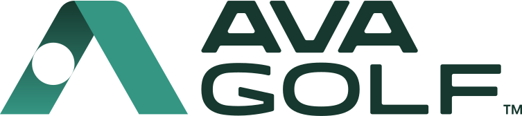
Mono
These are for when color is not available or the logo needs to be colored to work with a partner's brand.
Clearspace
Like us, logos need room to breathe. We have recommended minimum clearspaces, but it's important to remember that more space is better, up until the point where the logo feels lost. Find that balance.
Minimum clearspace on the icon and combination marks is 50% of the icon size.
Minimum clearspace on wordmarks is 100% of the Y axis.
Clearspace excludes the TM symbol for the purposes of boundaries.
 x100% y
Logo Don'ts
We always want our brand to look best. While we can't list every single thing to not do, these are some common mistakes people make. If you are ever unsure or think something doesn't look right, it probably isn't. Always check with the AVA Golf team.